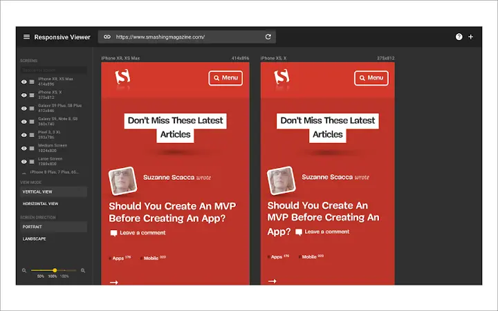
Responsive Viewer is a highly used and valuable Chrome extension designed for front-end developers. It enables them to test and observe multiple screens while developing responsive websites and applications simultaneously. This simplifies the visual testing and ensures a smooth, seamless experience across different screen sizes and platforms. With over 200,000 users, this tool is clearly trusted by developers globally. This extension was ingeniously designed by Dima Hamayunau, whose work can be found at https://dribbble.com/abybe.
With privacy being a major concern in today’s digital age, the creators of Responsive Viewer have made clear specifications. The extension does not track or collect any user data, and it isn’t connected to any server to store data, ensuring absolute user privacy. For those interested in delving into the nuts and bolts of this tool, the source code is readily available at https://github.com/skmail/responsive-viewerExtensionDeveloper Tools. The extension’s current version is 4.7, last updated on July 18, 2023, continuing to provide top-tier service with each update.
| Extension Name | Responsive Viewer |
| Users | 200,000 users |
| Rating | 4.7 |
| Version | 1.0.21 |
| Updated | July 18, 2023 |
| Category | Developer Tools |
What is the Responsive Viewer Chrome Extension
Responsive Viewer is a highly practical tool used mainly in the field of web design and development. Precisely, it is a browser extension that allows users to test their websites under different device resolutions.
This incredible tool provides a plethora of features that streamline the process of responsive testing. Moreover, it accommodates custom device presets and screen sizes, thus broadening its usability.

How to use the Responsive Viewer Chrome Extension
Responsive Viewer is a helpful tool used in web design to check how web pages adapt in different screen sizes. This tool can be used by activating the responsive viewer option, usually located in web development settings or on the side panels of web editing platforms. Once activated, the viewer shows how the webpage adapts to various screen dimensions, from small mobile devices to large desktop screens.
To use it effectively, it is recommended to load the webpage first before activating the responsive viewer. This way, one can observe in real-time how changes to the webpage layout or content affect its responsiveness. Furthermore, navigation within the webpage can also be tested for glitches. By comparing the webpage display across various screen sizes, any inconsistencies within the design can be spotted and addressed.
Therefore, mastering this tool is paramount for any web designer wanting to create versatile and user-friendly websites.
[jetpack-related-posts]
Introduction
In the age of technology, where browsing choices are diverse and numerous, maintaining the responsiveness of websites or applications across multiple screens is essential. Whether it’s through a smartphone, tablet, desktop, or smart TV, users should enjoy a seamless experience, irrespective of the screen size or platform they are operating from. This requirement triggers the need for front-end developers to test and ensure optimal responsiveness in their creations consistently. That’s where the Responsive Design Tester: A Chrome Extension comes in handy.
What is the Responsive Design Tester Chrome Extension?
The Responsive Design Tester is a groundbreaking Chrome extension that enables front-end developers to view and test their product across multiple screens in one view. It helps ensure that the design and functionality of websites/applications do not compromise, regardless of the viewport or the device. The tool, being a product of the creative genius Dima Hamayunau, simplifies the task of responsive experimentation thereby making the development process faster, smoother and more efficient.
How does it work?
This chrome extension allows developers to simulate multiple screens in one view and test the responsiveness of their website or app within different frames concurrently. Given its user-friendly design and straightforward application, even novice developers can utilize it without advanced technical knowledge.
Simply upon installation from the Chrome store, it embeds directly into the Chrome developer tools, offering the convenience of testing responsiveness without switching tabs or windows, or employing separate programs.
Key Features of the Responsive Design Tester
The major standout feature is the ability to display multiple simulated screens at once. Developers can select different sizes and orientations of viewports to emulate different devices. In addition, it also offers several predefined device sizes, including the typical dimensions for desktop, laptop, tablet, and smartphone screens.
Privacy and Transparency
Regarding privacy, the extension does not track or collect any users’ data. Code transparency is another prominent feature of this extension. The entire source code for the extension is freely accessible on GitHub, allowing curious or concerned users to inspect the backend mechanisms and ensure their reliability and robustness.
Ultimately, the main goal of the Responsive Design Tester is to streamline the responsive design process and eliminate the joyless task of manually testing applications or websites across various screen sizes. With this innovative tool, front-end developers can remove guesswork from their tasks and deliver a truly responsive experience.
Conclusion
Users will be informed whenever there’s an upgrade or bug fix. The extension’s most recent update, version 1.0.21, was deployed on July 18, 2023.
In the modern, fast-paced world of front-end development, the Responsive Design Tester will undoubtedly take its deserved place as an invaluable tool in every developer’s arsenal.
FAQ
A Responsive Viewer is a tool that allows designers and developers to test the responsiveness of their websites or apps on multiple devices in a single view.
Enter the URL of your website or app, and the Responsive Viewer will display how it looks on various devices. You can switch between devices, rotate them, and simulate different resolutions.
Yes, most Responsive Viewers allow you to customize the devices list and add new ones to fit your needs.
No, while Responsive Viewers are great for initial testing and catching common issues, they do not fully replicate the behavior of actual devices. It’s still important to do final testing on real devices.
